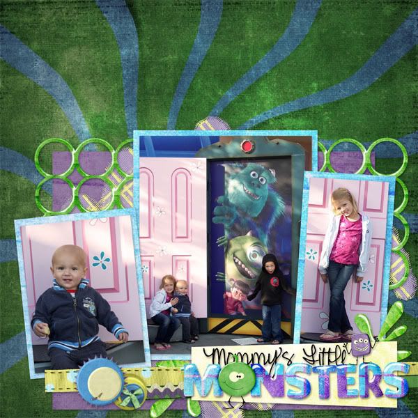
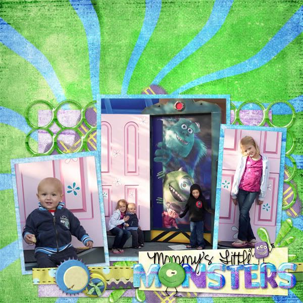
Okay I'm having trouble deciding which layout I like better. I thought I wanted the background dark so the pictures would pop better, but I'm just not sure. Which one do you like, the first one or second one?
~
I used Jewel Scraps new kit "In My Closet"


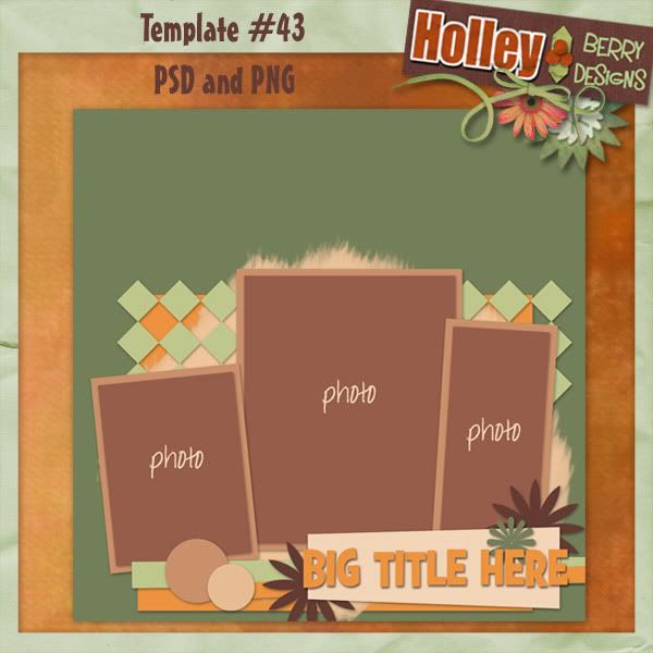
Here's the template!

Download link expired


8 comments:
2nd one...but i'd also make the picture frames just a touch darker.
I agree with Connie, the lighter background and try making the frames a little darker. =)
Thank you! Your blog post will be advertised on the DigiFree Digital Scrapbooking Freebie search engine today (look for timestamp: 07 Oct [LA 07:00pm, NY 09:00pm] - 08 Oct [UK 02:00am, OZ 12:00pm] ).
I prefer the 1st one, in the second one the pictures just seem to be lost in the background of the same colours and they just don't pop out to me.
Thanks for the template!
I agree that the 1st one with the darker background shows the pictures better. The background of the pictures is light already.
Thanks for the great template.
If you want pop, I think the first one achieves it.
Thank you so much for this Freebie. I want to let you know that I posted a link to your blog in CBH Digital Scrapbooking Freebies, under the Page 9 post on Oct. 09, 2009. Thanks again.
I thing template # 43 is a real professional work it does not means that others are not good but i personally like template # 43
if you visit my template plz click on this link Unique Web Templates.hope you also like it
Post a Comment